Shopify Development
McSquares
The Art of Whiteboarding
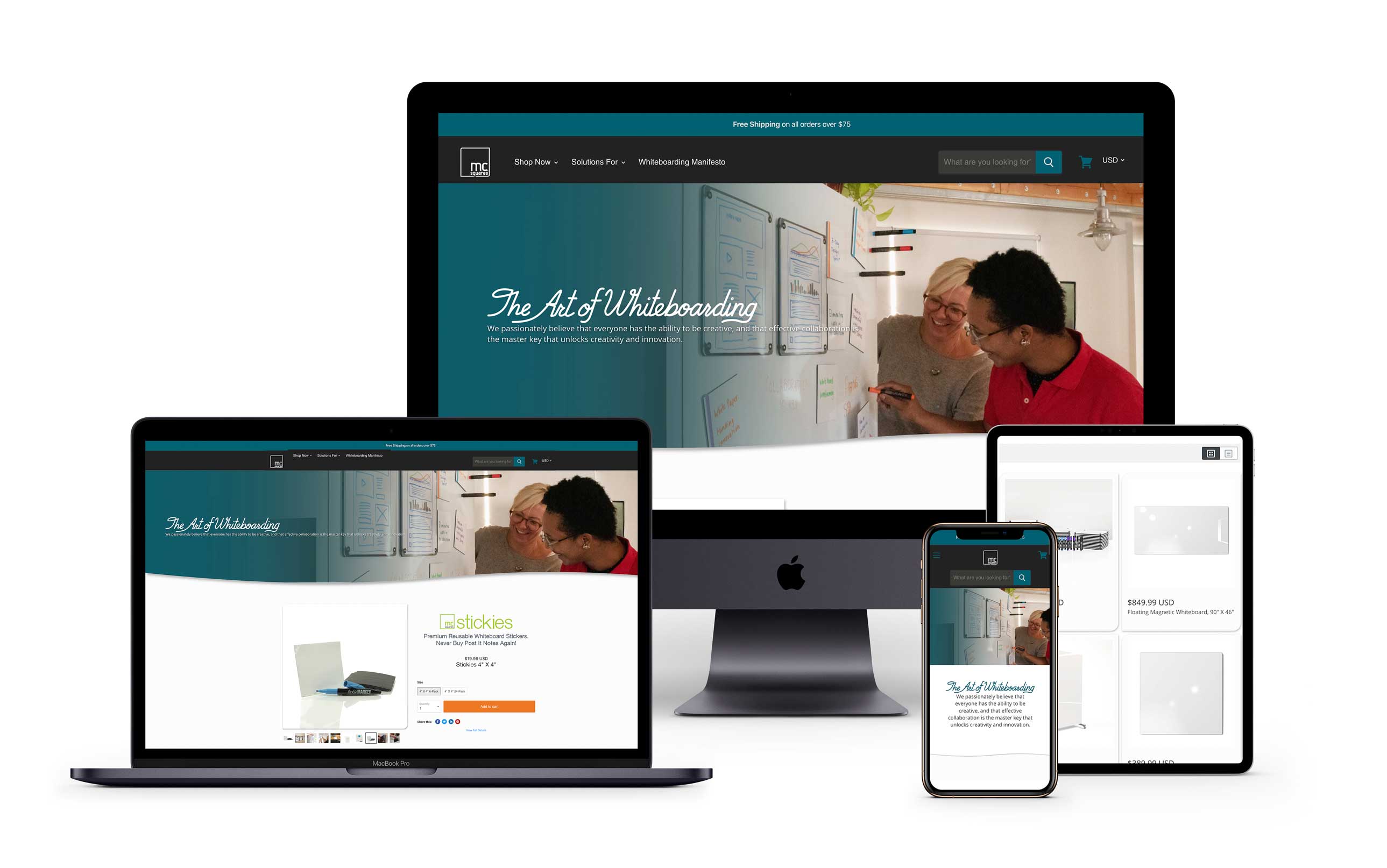
McSquares is a small team of designers and engineers building an ecosystem of collaboration tools that empower face-to-face communication, discovery, and innovation. They tasked us to build a highly performative new site focused on the dynamism of their products.

The Result
We created a high conversion site that focuses attention on the mcSquares dynamic products, while speaking to mcSquares mission: '...a blank canvas for the best and brightest.' Equally important, the new site needed to be easy to update, allowing the internal staff to make content and educational campaign changes on a frequent basis.
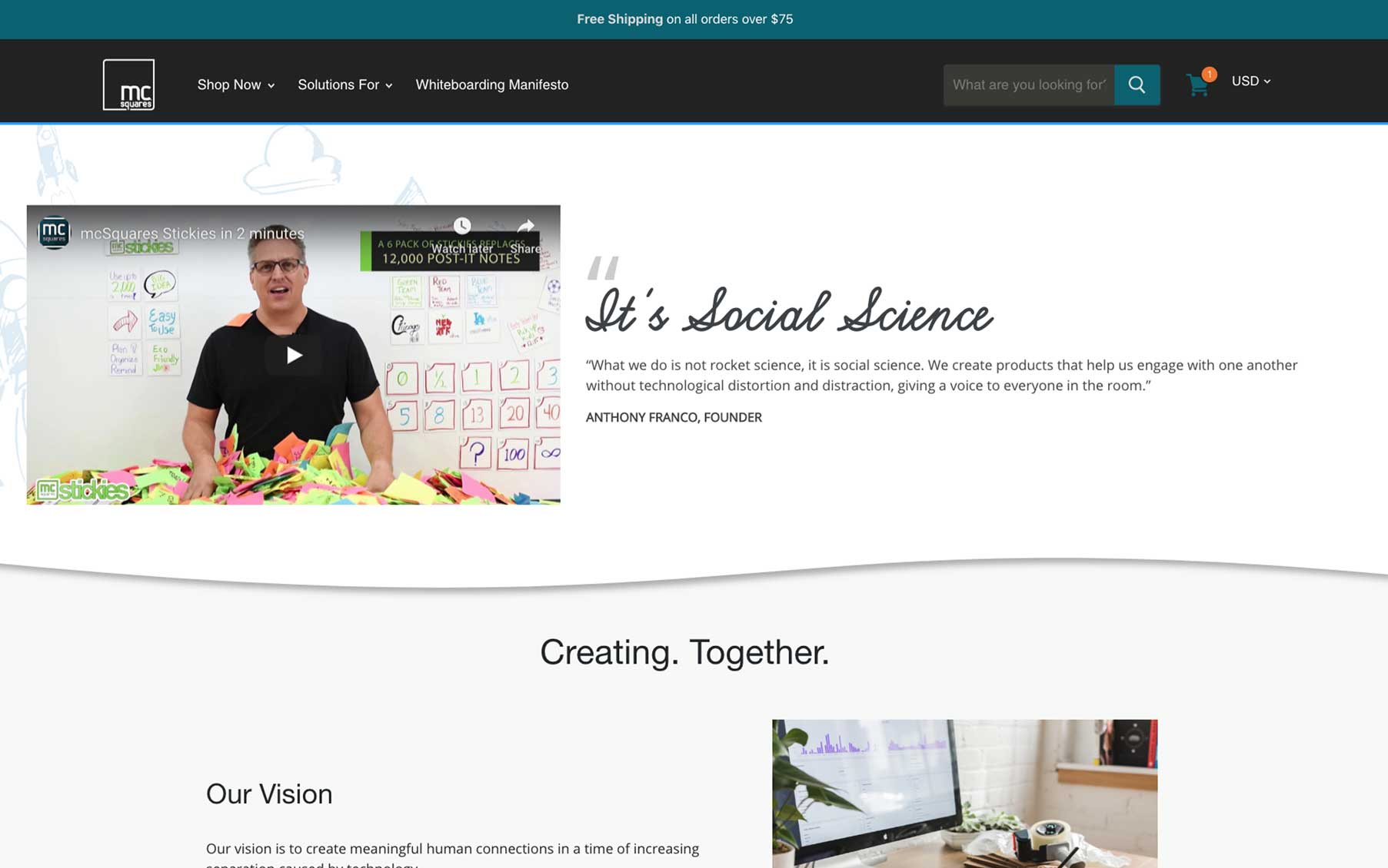
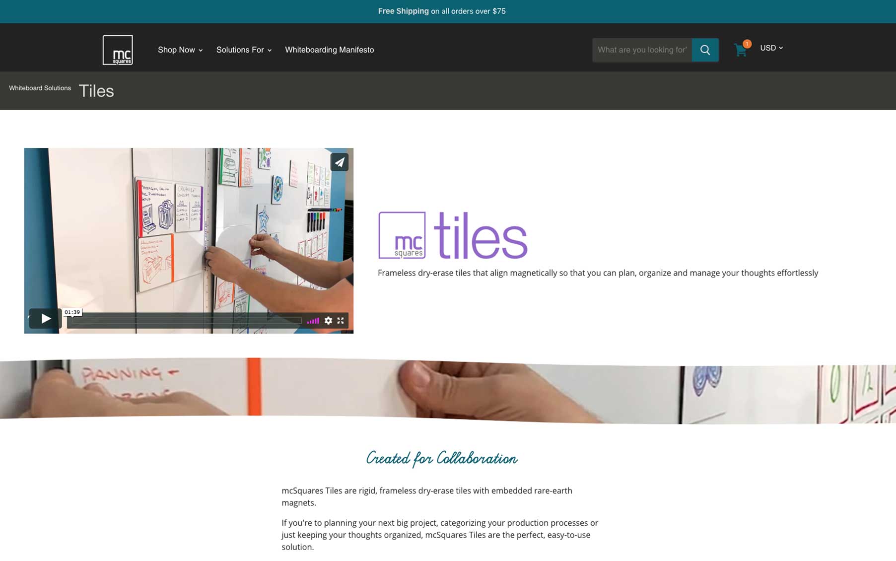
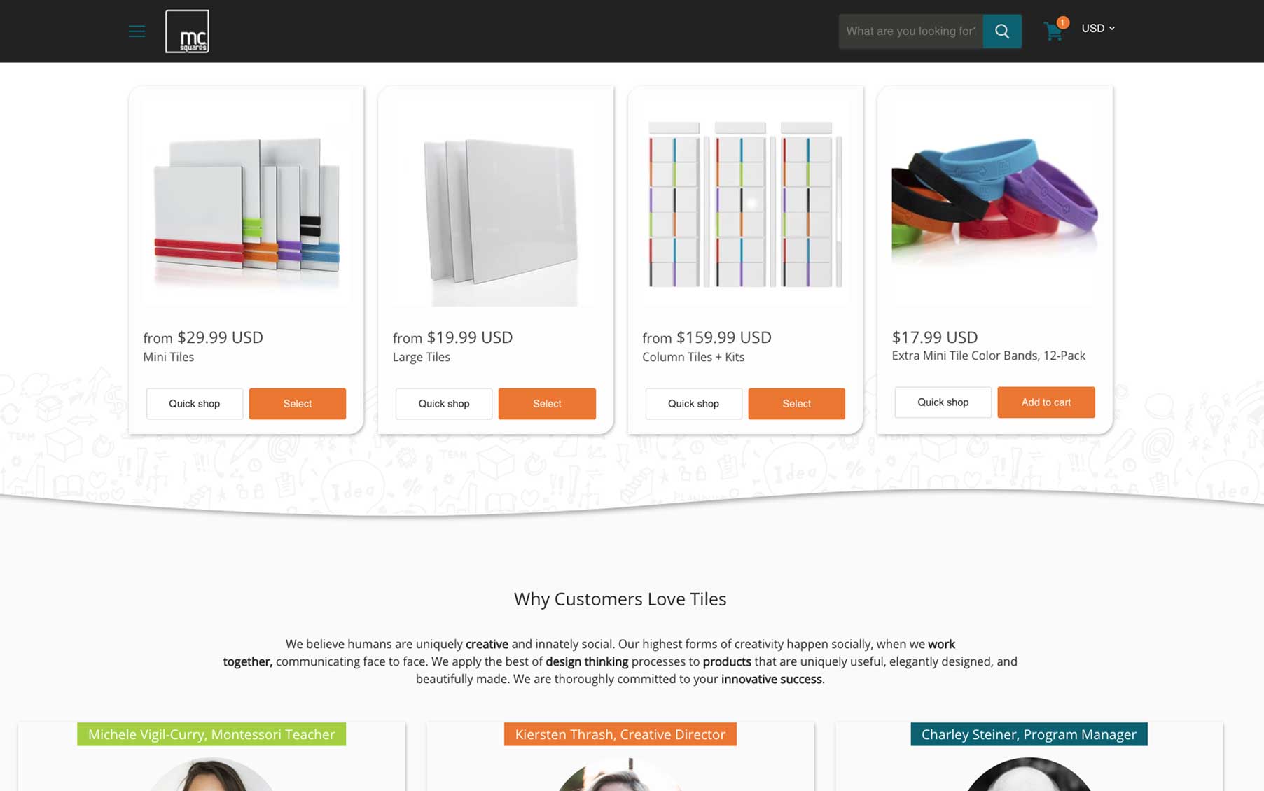
While it may not be apparent at first glance, there’s nothing ‘square’ about the product line McSquares creates. And, since the format of a typical e-commerce site lends itself to a series of repeating squares we ought ways to break the frame such that the product could shine through. Our challenge was to design a site with Amazon ease of use, while reducing the repetition of ‘square shapes’, allowing McSquares to jump off the page.
Working closely with the client we sought to build a site that put function first – with performance, conversion, and purchasing ease of use as primary goals. Following this, we took steps to break the grid with curving sections, hand drawn patterns, and containers designed to mimic the unique shape of McSquares tiles. The outcome is a site similar to our client’s product that matches form and function.
Following their investment from SharkTank investor Kevin O’leary we retooled and refactored their online presence through tremendous growth and success. In just 18 months from launch they saw 400x growth, become the worlds first REG CF crowd funded company, and saved a billion stickie notes from landfills to become the most premier whiteboarding company in the world.
